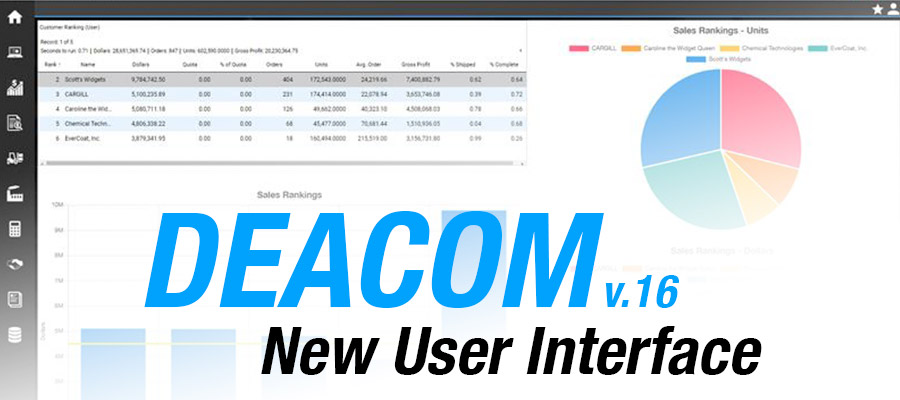
The Deacom team completed an overhaul of the DEACOM ERP Web interface as part of version 16 of the software.
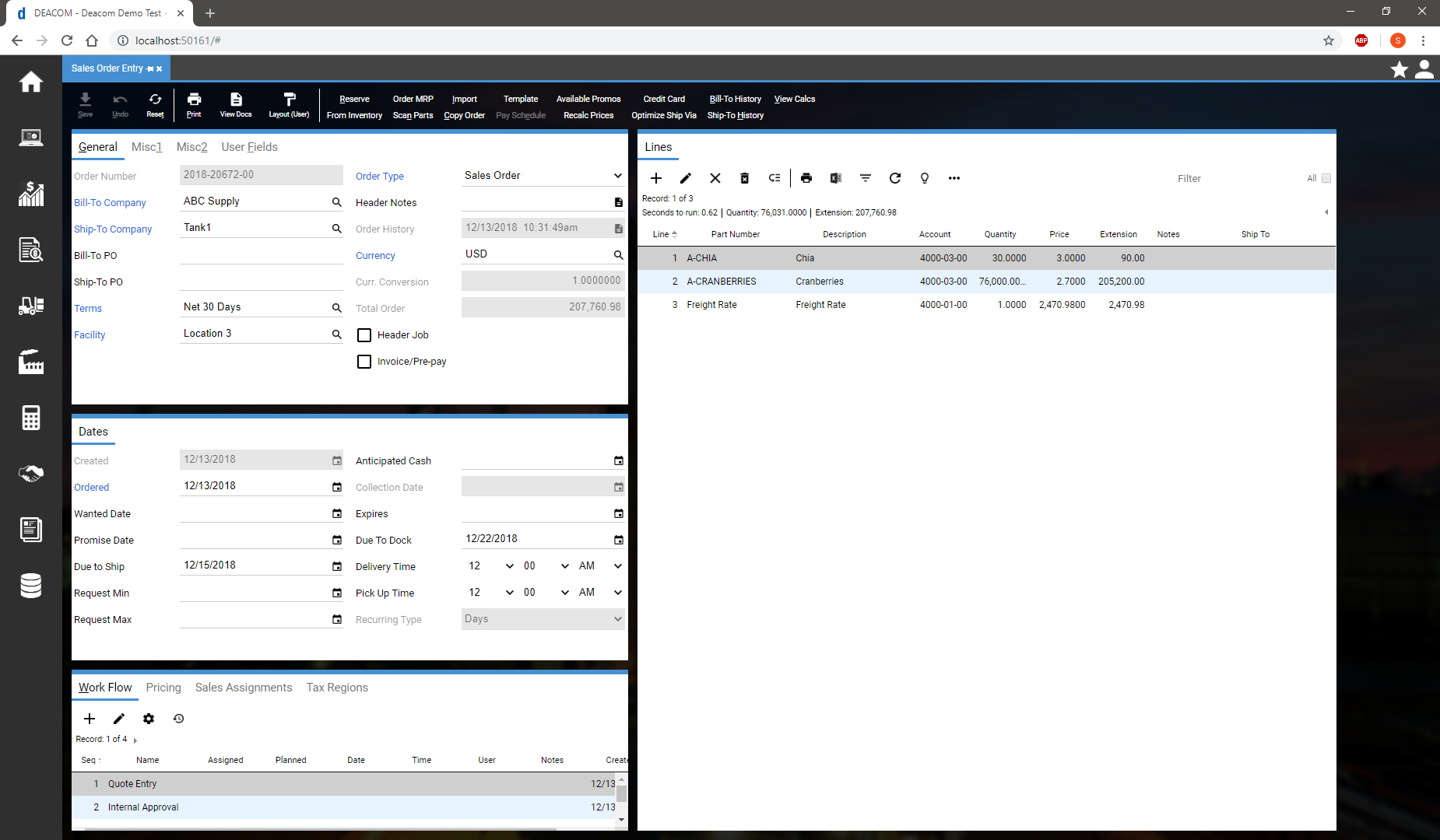
Here are some of the key biggest differences that users will notice:
- Menu Icons Down the Left: Previous versions of DEACOM had the menu options across the top of the screen. The new menu is icon-based and down the left-hand side of the screen to maximize space and for aesthetic purposes. Icon captions appear as soon as the mouse moves to the applicable menu area. (For those like us who can never remember what a specific icon is!)
- Expanded Forms Horizontally: Forms now expand further in width to maximize screen efficiency. Users have access to more fields with this approach. With the DEACOM form builder, each form can still be tailored to an individual user as needed.
- Look and Feel: Minor adjustments to the look and feel were made as part of the overhaul. All of these interface changes were made with the goal of preventing end-users from having to be trained on the new interface when upgrading the software.
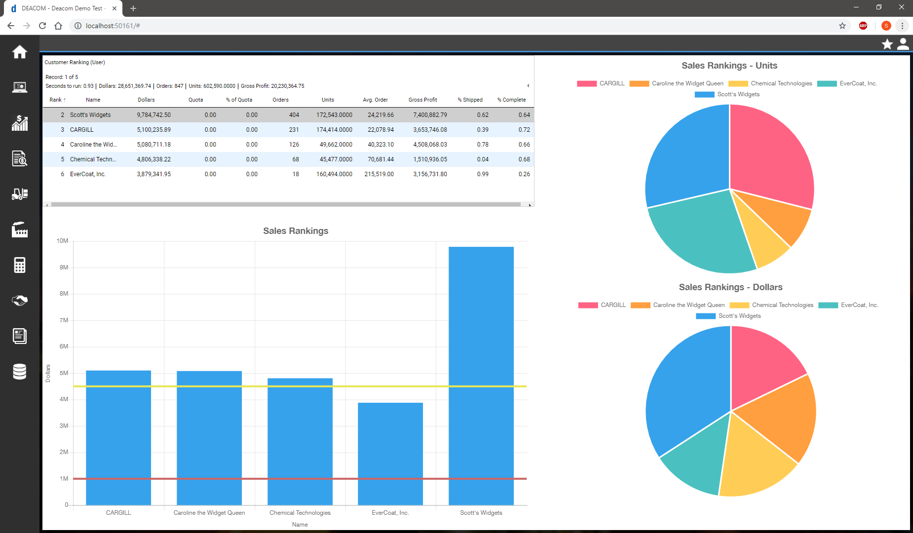
The new version 16 interface also puts an emphasis on dashboards which have been redesigned:
- Now on the Home Page: Dashboards are now available as an option on the landing page in DEACOM. Drill down directly into management reports and complete required action items directly from your configured dashboard.
- Dynamic Dashboards: Dashboard elements can now be linked, enabling a specific record to be selected to pivot the linked dashboards.
- Soothing Colors: A new, more soothing color scheme has been implemented to freshen up the look.
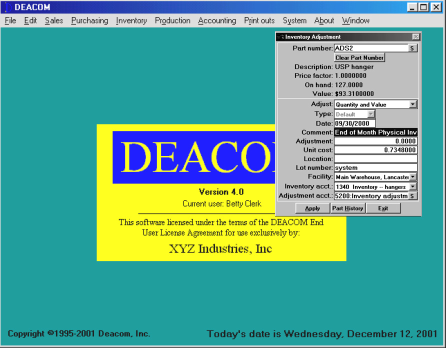
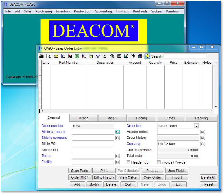
DEACOM’s user interface has consistently evolved since 1995. We had fun throughout this project reflecting on all of the designs throughout the years. Despite 25 years of evolution and significant changes to technology, you can still see similarities between DEACOM 1.0 and DEACOM 16.0.
Version 16.0 will be dropping at the annual DEACOM Discover User Conference in April. Come explore the new features and functions with us!
