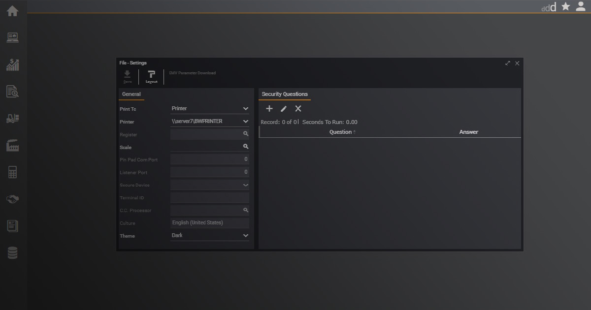
In addition to its current default theme, Deacom 17.01 supports light and dark mode themes. Setting your theme preference to dark mode means that it will display white text on a dark background, and light mode displays grey text on a light background. Users can set their theme preference and the app will use that theme each time they log in.
How to Set Your Theme
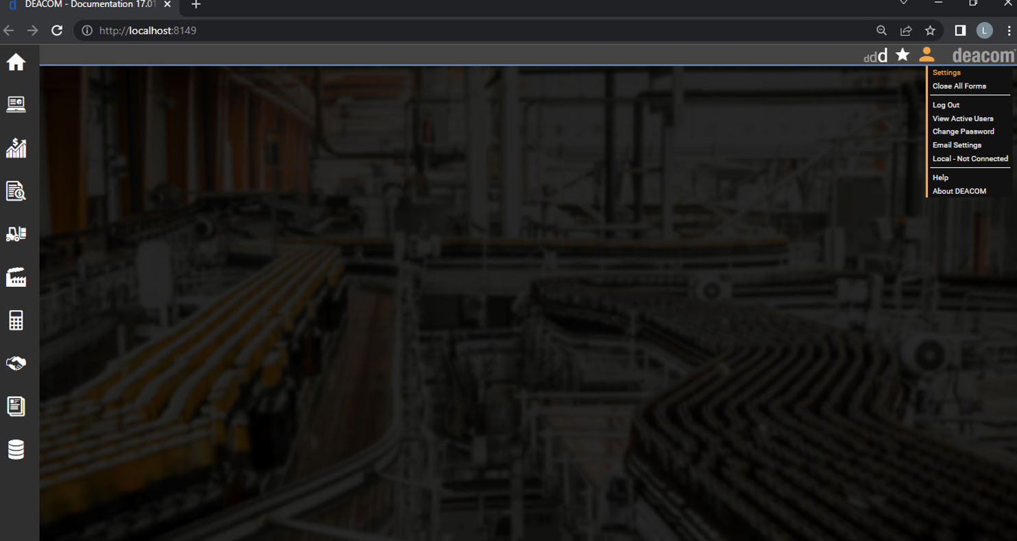
Once logged in to Deacom, hover the User icon, and select Settings.
In the File – Settings window, Select the Theme drop-down menu. You can choose from Dark, Default, and Light.
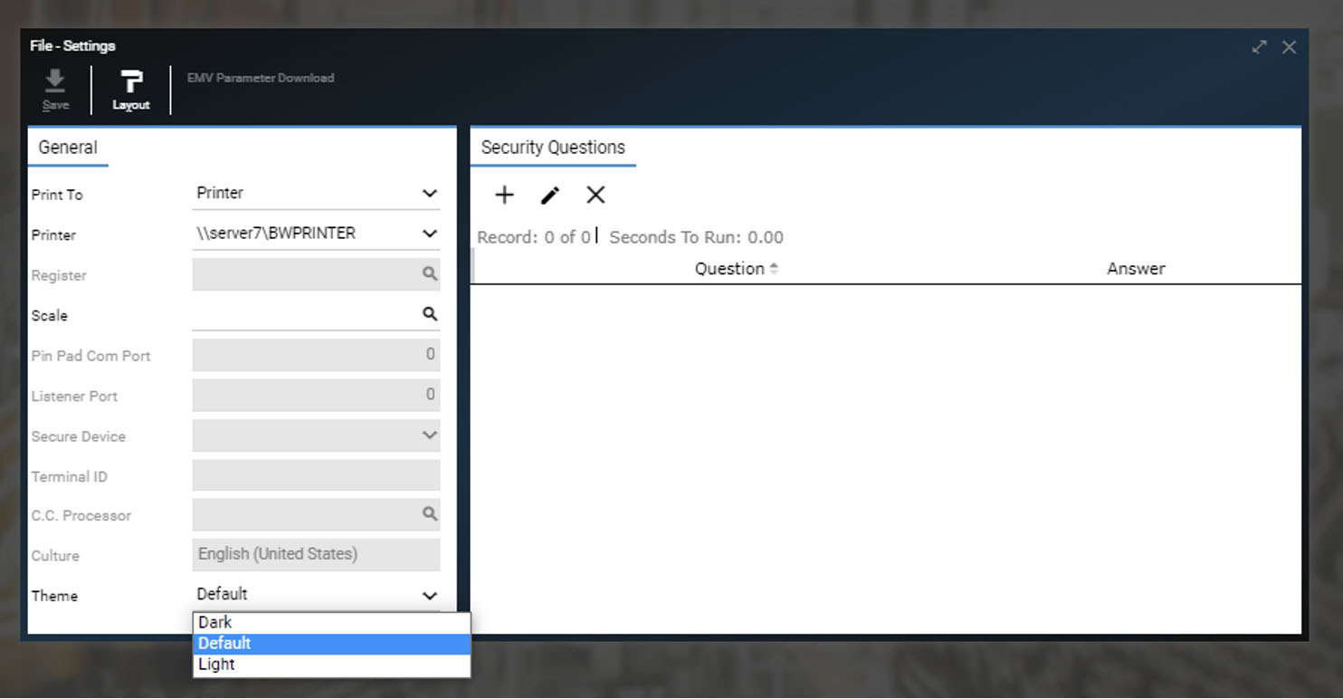
Once your Theme is selected, click Save and close the File – Settings window.
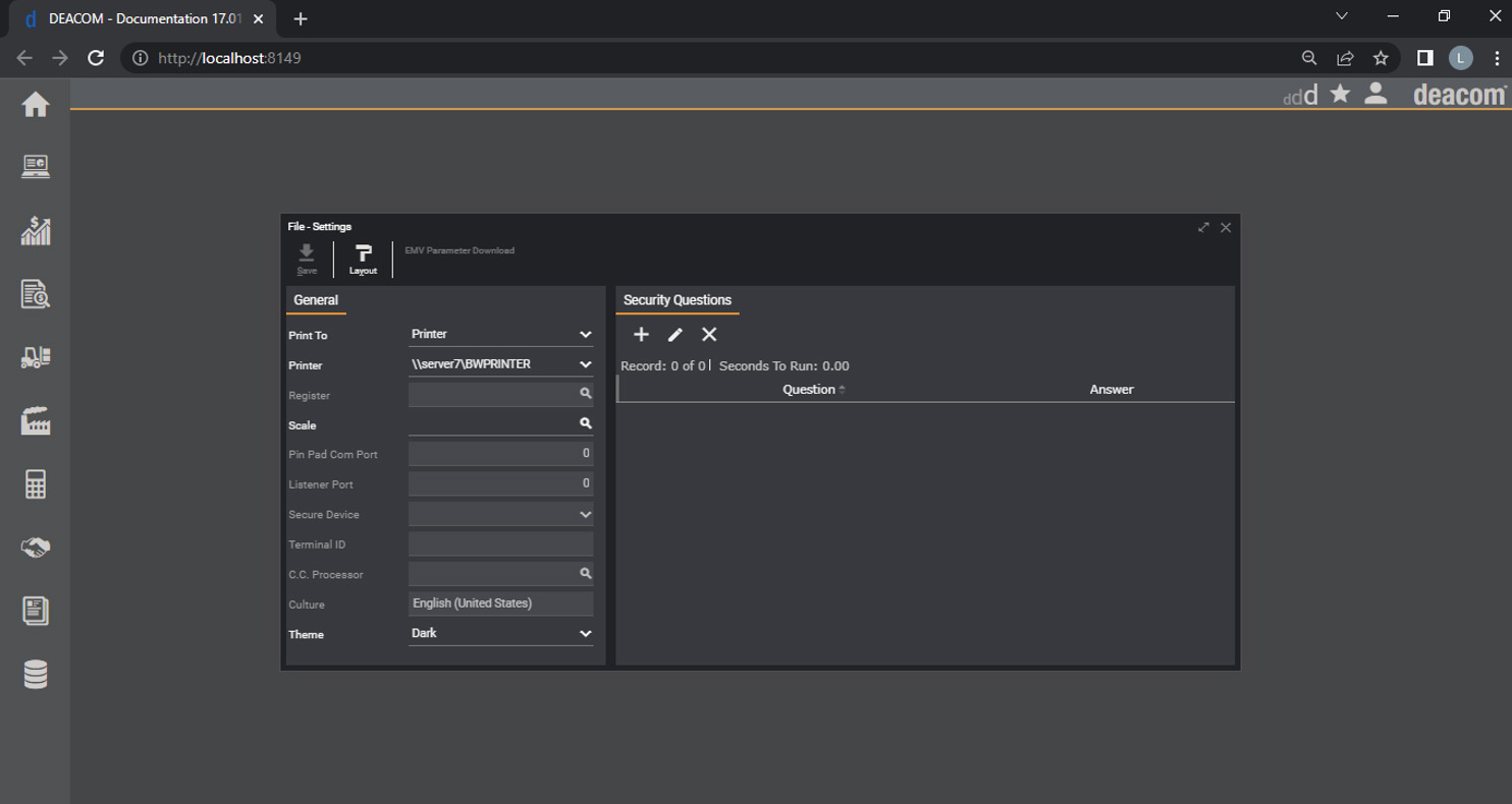
Here are some of the benefits of using dark mode:
- Great for darker workspaces
If you are working in the dark, whether early in the morning or at night, a bright screen can result in high screen contrast, which can be harsh on the eyes. Dark mode makes the colors more tolerable to your eyes under low-light conditions. - Reduces blue light
Blue light, which is present in digital screens, affects the circadian rhythms of your brain. These rhythms dictate the chemicals that allow you to get to sleep easier or when you should be more alert. Reducing blue light whenever possible can help preserve natural circadian rhythms. - Decrease eye fatigue
Dark mode can limit eye strain, fatigue, video glare, flicker issues, and photophobia. - Uses less energy
Dark mode may help laptops and other devices extend the lives of batteries.
Dark mode is a helpful option, but Deacom users still have the flexibility to switch between light mode or the default theme depending on circumstances like time of day or working conditions.
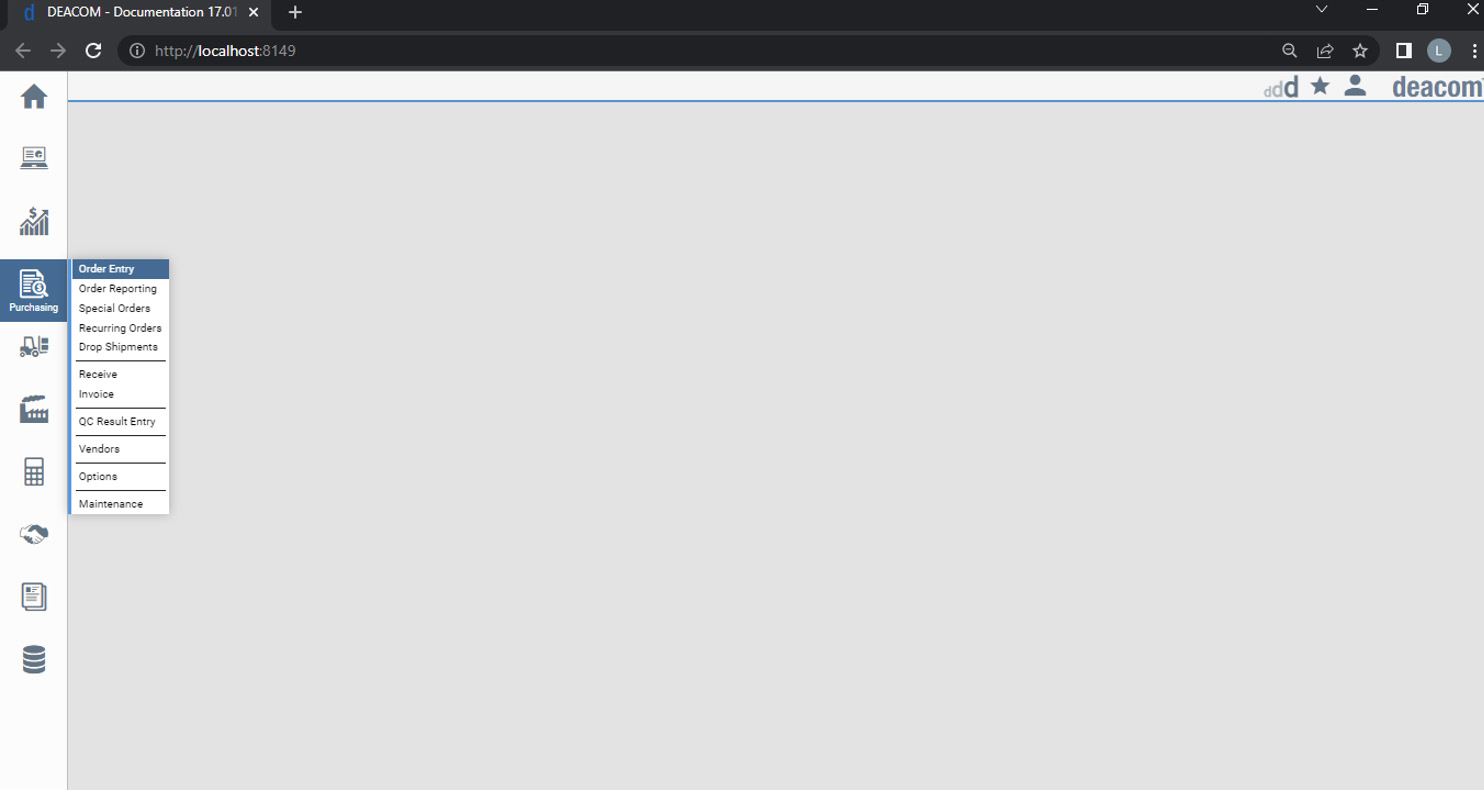
Using light mode comes with its own set of advantages as well:
- Best for reading smaller text
This option emulates the look of ink on paper, making text more readable during well-lit conditions. - Displays information clearer
Proper use of light mode can give the display an image of purity and clarity. - More overall light and so the pupil contracts more
Smaller pupil sizes make the eyes less susceptible to spherical aberrations, greater depth of field, and overall better ability to focus on details without tiring the eyes.
When it comes to color themes, it all boils down to preference. This feature simply gives you the option to customize how the app appears on screen by selecting what’s best for your eyes.
Here is a brief video showing the new light and dark theme preferences in action:
