In order to provide our customers with the best experience possible, we have just launched a new set of modifications to the DEACOM Help system that center around how you go about finding information. Here’s what you need to know:
Objectives of the New System Navigation
- Provides the user with key information about DEACOM.
- Search limitations made easier with more direct site navigation.
- New Help Maps offer clearer guidance in DEACOM by using a similar structure.
- New home page is more consistent with the other Deacom branding concepts.
- More comprehensive sections covering critical information.
Functional Area Guides
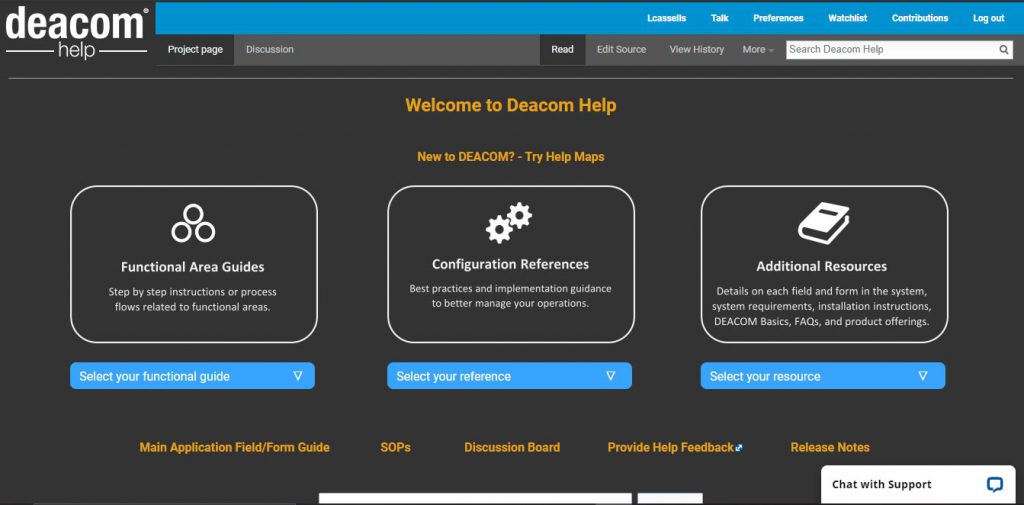
Functional area guides indicate the DEACOM process used to accomplish the task. Users can click on the task within the process flow to go to the appropriate help page.
Help Maps
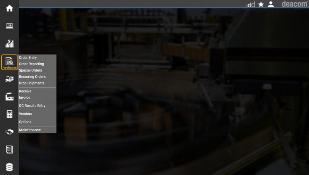
Help Maps send users to help pages based on the task or transaction they are performing in the DEACOM application. The maps mimic exactly what the user sees on their screen.
Once you click on the menu option, you are taken to the listings of the fields and forms of that selection. That page will also include links to the best practice and troubleshooting pages for that particular transaction. (Menu options dealing with system options and maintenance areas will provide the information necessary to update or modify those sections.)
Efficiency Improvements
Efficiency was measured by counting the number of “clicks” to arrive at the first Page/Concept in the different Help System setups. (This does not include the search bar.) The act of hovering over a dropdown menu does not count as a click, however, selecting an item within the dropdown menu does count.
| Page/Concept to Navigate to |
# of Clicks Old System |
# of Clicks New System |
| Main Application Guide | 2 | 1 |
| Using Job Entry Function (Production) | 3 | 2 |
| 16.04 Release Notes | 2 | 2 |
| API Library | 2 | 1 |
| Linking Documents to Records | 3 | 1 |
| Purchasing Best Practices | 2 | 1 |
| Help Maps | Not Applicable | 1 |
| Regulatory Compliance | 2 | 1 |
| Un-Invoicing a Sales Order | 3 | 2 |
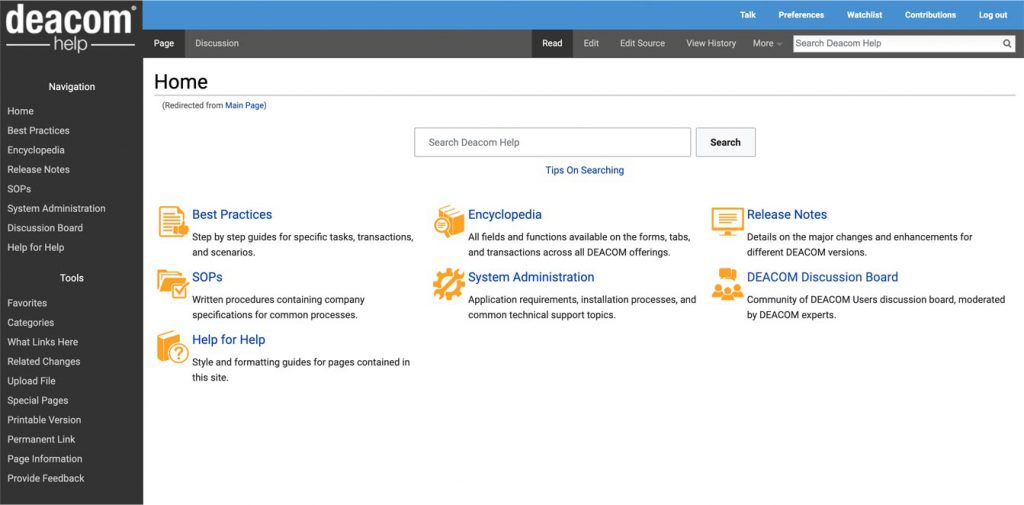
Old Landing Page vs. New Landing Page
Based upon recent feedback, there were a few navigational challenges that our users were experiencing in the original Help System. Our goal is to provide more focused guidance and instructions while remedying search limitations with easier, more direct site navigation. We hope you enjoy the changes we’ve made to the DEACOM Help System.


